
The New Face of the Hagerman Valley Inn
New signage was on the top of the list for updates to the property. Overhead there was a giant and very faded billboard, the main road sign and of course the sign on the front of the building. The infrastructure was there, but what was hanging on it wasn’t doing us a lot of favors. So, why did it take us until May 2023 to finally make the change? There were so many options!
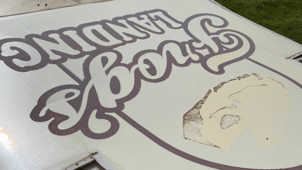
I knew Frog’s Landing needed a modern look. The name was iconic and the nickname of our founder. We wanted to honor the true essence of it’s name, but put a more modern spin on it. I asked a designer with a great mix of clean, classic and organic designs to create a new frog for the HOA. They created the perfect muted blue and tan logo to replace the faded frog on a lily pad. After I received the design, I reached out to Mark to make sure he liked it as well. It’s his nickname and he definitely needed the first say. The new Frog’s Landing look was starting to come together.
Paused Projects
Like so many areas of this business, things took longer than I expected and hoped. A lot of the delays were a result of my own creation. I put a lot of pressure on myself to get things right. These were big decisions, with big price tags and I wanted to make sure we had them perfect before moving forward. But, perfection is the enemy of progress, as the saying goes and we probably would’ve gotten further ahead if Jim and I just went with our first instinct. Eventually progress won out and we landed on a theme and designs for the signage.
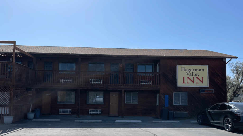
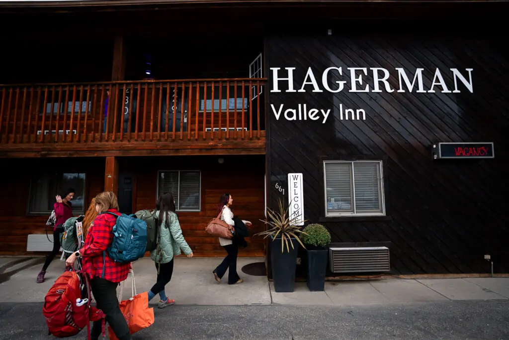
Hagerman Valley Inn Sign
The sign on the front of the hotel was the most difficult decision. The previous sign was an illuminated box with a logo in the center of an acrylic square. It did a great job of getting the job done. You knew where you were and could see it from the highway. Unfortunately, it was faded and needed a facelift. We scoured over other commercial signage examples. What would provide the first impression we were looking for and do the job we needed?
After lots of Pinterest boards, Googling and months of back and forth with the sign company, we finally decided simple was best. The new sign is classic, visible from the highway and looks great! You’ll now see the word ‘Hagerman’ in large white lettering, followed by a somewhat smaller ‘Valley Inn’ directly below. We wrestled with illuminating each letter, but based on the complexity of the project and the impact it would have on the building, this seemed like the best answer. We felt up-lighting would be an effective solution if it proved hard to see. It was simple, bold and did the job perfectly.
The Marque Sign
The marque sign along the highway was also slotted for updates. This was also challenging due to the size of our sign and the shape of our logo. When the logo was created our swoosh is meant to reflect the waterfalls that make Hagerman so gorgeous. If you look closely it is the letter H squiggled into a waterfall. Sadly this didn’t translate well into the smaller rectangular sign. We also wanted it to tie into the new Frog signage. So we went back to the drawing board.
This time we pulled from another segment of our area. Hagerman is famous for migratory birds. This can be great for photographers, bird watchers, but most of all hunters. My husband is a waterfowl and upland game hunter. In the very early months of our ownership, the duck hunters flooded to our area after several big snow storms. They were such great guests and Jim bonded with them over stories and ducks. We will always have fond memories of that first winter at the Inn. With a little modern flair we chose the silhouette of a duck to adorn the sign along the highway. The colors are more muted than our logo, but it matches the aesthetic of the Frog’s Landing sign and keeps with our vision. It was a win, win for us.
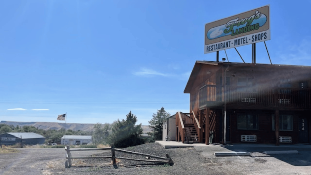
Billboard
The billboard is attached to the Inn’s roof and provides a great welcome to the area as visitors come from the south. The hotel and other businesses in the area are below the highway and it provides the height the HOA needs to get people’s attention. We used the large Frog’s logo and some of the same design elements from the original sign. We wanted to convey what travelers could find here in a quick, concise way. The group worked together to come up with what the sign needed to say and make it look great as an entrance to Hagerman.
Shortly after, we had our approved designs, production timeline and deposit paid. It was finally happening!
Installation Day
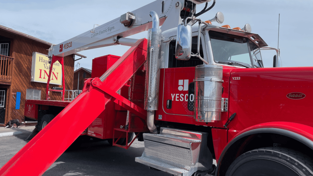
The renders had all been approved and we were officially scheduled for install. It was a crisp morning in Hagerman, one where the dew was heavy on the lawn. I was anxious with excitement driving to Hagerman. They didn’t give us an exact install time, but assured us it would be in the morning. I had waited a long time for these signs to be updated and wanted to see them in action.
They started with the marque road sign. The north facing slots were mostly finished when I arrived and they were starting on the south slots when I pulled in. I probably looked like a crazy person driving by so many times before stopping, but it was finally happening! We took photos from almost every angle. I stopped to speak with the installers and took a few more photos. Their work on the highway sign was quick and they moved over to the inn’s sign.
They started on the old sign. Pulling down the front acrylic and then dismantling the metal casing. We’re not sure how long the sign was up, but the wood siding behind it was clearly protected from the elements. We had removed the old sign, but there was a very evident box that remained. I later re-stained the front of the hotel, but the shadow of the old sign still lingers. You can still see it in the photos on the website. The old sign will always haunt us a little. They installed each of the letters and tweaked a few spots, but quickly we had a brand new, more modern look and feel. It was incredible.
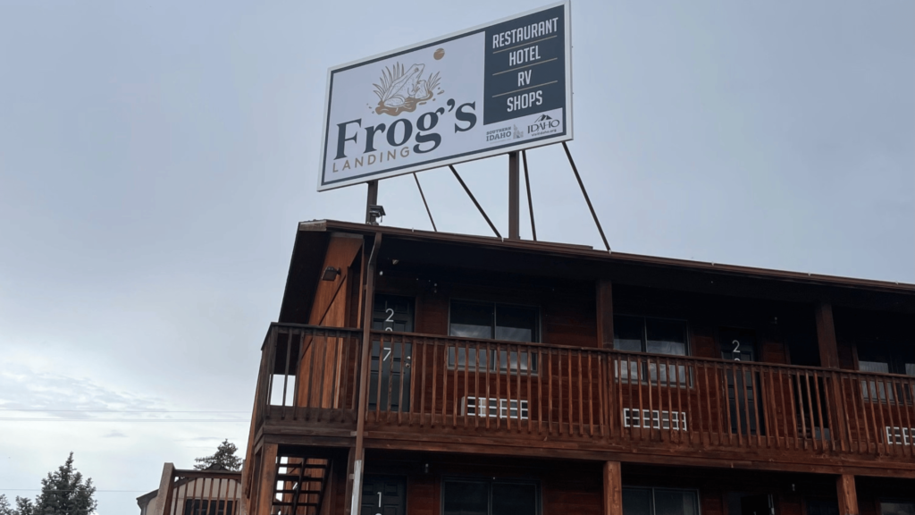
The Billboard
The last piece of the puzzle was the ten foot tall billboard that stood on the roof of the inn. It was once a bright sign that directed visitors to the restaurant, shops and of course the inn. It had seen many sunny and rainy days and most of the sign was very faded. The new frog looked as regal as ever in his new spot and the list of amenities grew to include RV. The Frog’s Landing area has grown and we wanted to reflect a few more things going on near the hotel.
Yesco installed all three signs quite quickly and the final result was breathtaking. Now, I realize as a guest you might laugh at a sign being breathtaking, but it was to us. Seeing the refreshed images and colors shining back on this amazing property was so wonderful. The new signs reflected a lot of history, partnerships, our guests and our unique blend of attributes. It was a welcome to all of our new guests and a promise to our loyal patrons. We will continue this legacy of excellence and help bring out our best for everyone that visits.
Is it a Sign?
Yes, you need to come visit! If you’re new to Hagerman or been coming here as a tradition, we strive to welcome you graciously and with excitement. Hagerman is one of the most unique towns in Idaho with so many great people and gifts to offer. We hope our signs help warmly greet visitors to town, Frog’s Landing and keep them around a little longer.
You can book a room or learn more about the area here. We hope to see you soon!