The Ongoing Saga of Nailing The First Impression
They say the eyes are the windows to the soul, so do the doors equate to the eyes of a hotel? We really wanted to reflect the right feel and introduce people to the rooms before they turned the key. The Hagerman Valley Inn is an external door, traditionally built motel. The doors are part of the guest’s first impression and we wanted to get their transformation perfect. They also caused a little drama in our renovation plans.
Perfection is the Enemy of Progress
This couldn’t be more true, especially when it comes to renovations. It’s something both Jim and I have suffered from. Either we didn’t want to waste the resources, give the wrong feel or just have to redo work that was already completed. Early on I was really hung up on several decision. I thought they were too big of a deal and didn’t want to get them wrong. Coming from a marketing background, not only is the wow factor important, but so is the initial opinion. A very good friend reminded me ‘we couldn’t really get it wrong’. I didn’t really have an answer to her very logical and no bs insight. It’s stuck with me, but not without a fight from the perfectionist in me.
As one of the low hanging fruit changes, door colors was one of the first modifications I wanted to make. As soon as the weather turned warm, we jumped on it.
Light My Fire, The Doors
In the beginning I had my sights set on blue as a highlight color for the hotel overall. I picked a bright blue color that would pop from where we are offset from the highway. Jim removed two of the doors and we started sanding. Harbor Freight was a frequent stop for us. We used a rotating buffer/sander with 60 grit paper. After the majority of the work was finished, I took on the nooks and crannies by hand. The doors were in rough shape and had a lot of imperfections, but the sanding helped immensely.
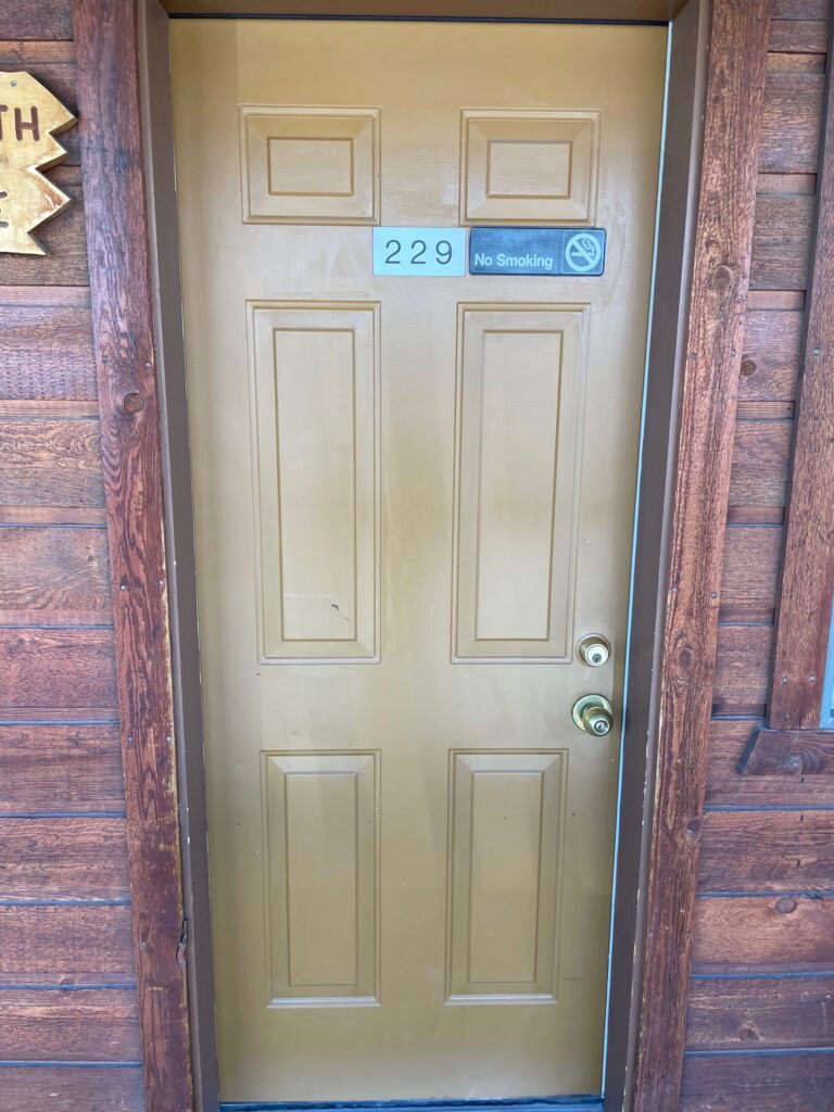
We rolled the first door to see what the color looked like. It was a big, fat meh. The doors were currently painted an orange/tan color. It could be that the primer wasn’t strong enough to offset the previous color. But the final door was awkward and not the blue I had envisioned. For the next door, Jim used an airless sprayer to apply a couple of coats. Still didn’t have what we were looking for. We tried a different blue and then wondered if it was more that blue wasn’t the meant to be.
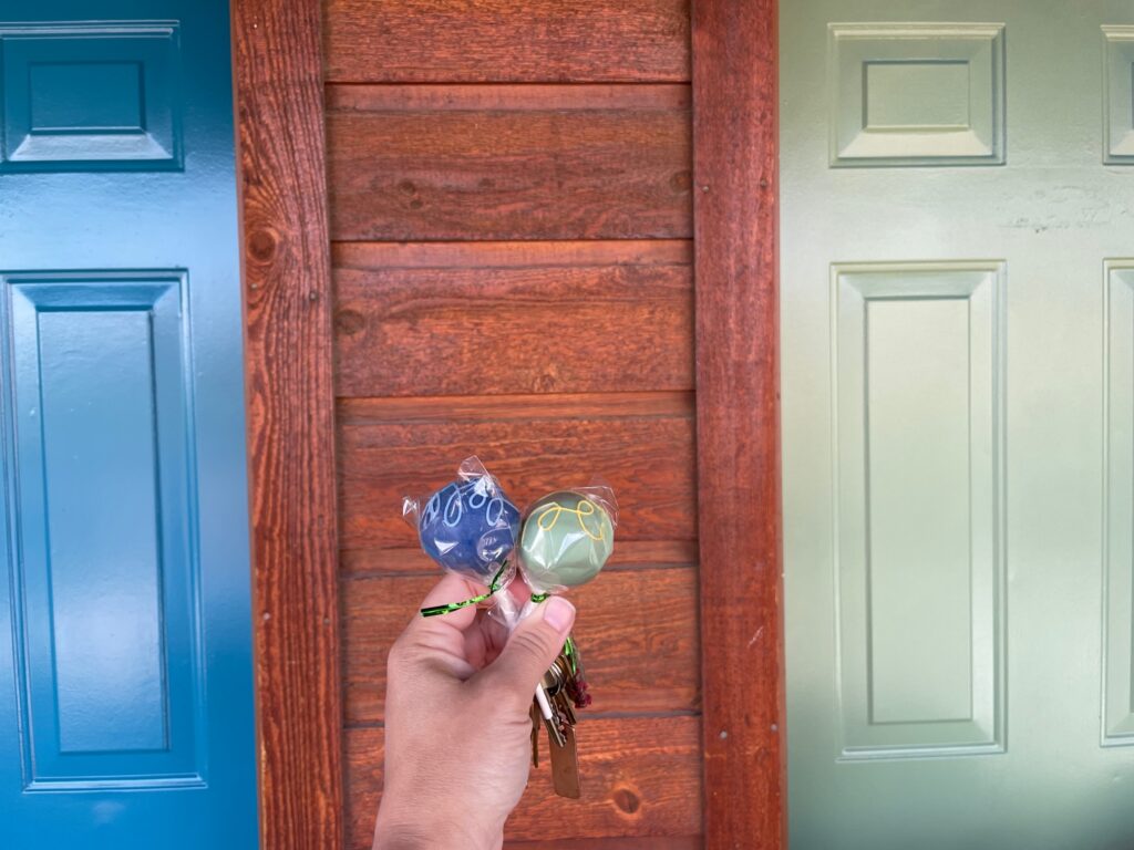
This was also not an ideal situation for Jim. The doors were heavy, hard to unhinge and even harder to line back up. To say he was annoyed with my color dilemma is putting it lightly. I tried a light green next. I actually really liked the green. I took a couple of side by side comparison and went to friends and family for a popularity vote. Literally split down the middle – what was it that my friend said to me…
Busy, Busy
After the warm weather hit, we also got hit with an endless wave of visitors. As new hotel and business owners, we had a ton of things to learn. I was also still the director at my previous organization and spring is always busy there as well. Weekends were really the only time available to do the full workup on the doors and we couldn’t get them down, sanded, painted and dried before they needed to be back up for guests.
The Hagerman Valley Inn, to my dissatisfaction, but also amusement, sat for almost year with a patchwork of green, blue and orange/tan doors. Guests that stayed with us frequently realized early on that the painted doors typically meant they were renovated rooms and started asking for those specifically. It was like a secret loyalty club we created without knowing. Can I have one of the green doors please?
All One Color
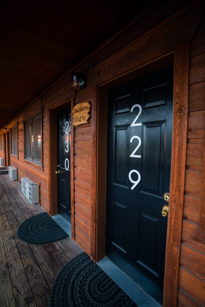
In February of 2023, we finally came to an agreement on the new sign as well as door colors. I researched a ton of complimentary colors to our cedar siding. I landed on Valspar’s Black/Brown. Jim was able to spray a few of the doors, but in order to complete the doors in time with minimal impact to our reservations I chose to hand roll each of the doors. The paint was an interesting consistency and bubbled when stirred. We made sure to do so gently, but it didn’t work. My opinion it was too thin – Jim’s opinion it was too thick (he paints more than me, so he’s probably correct, but shhh).
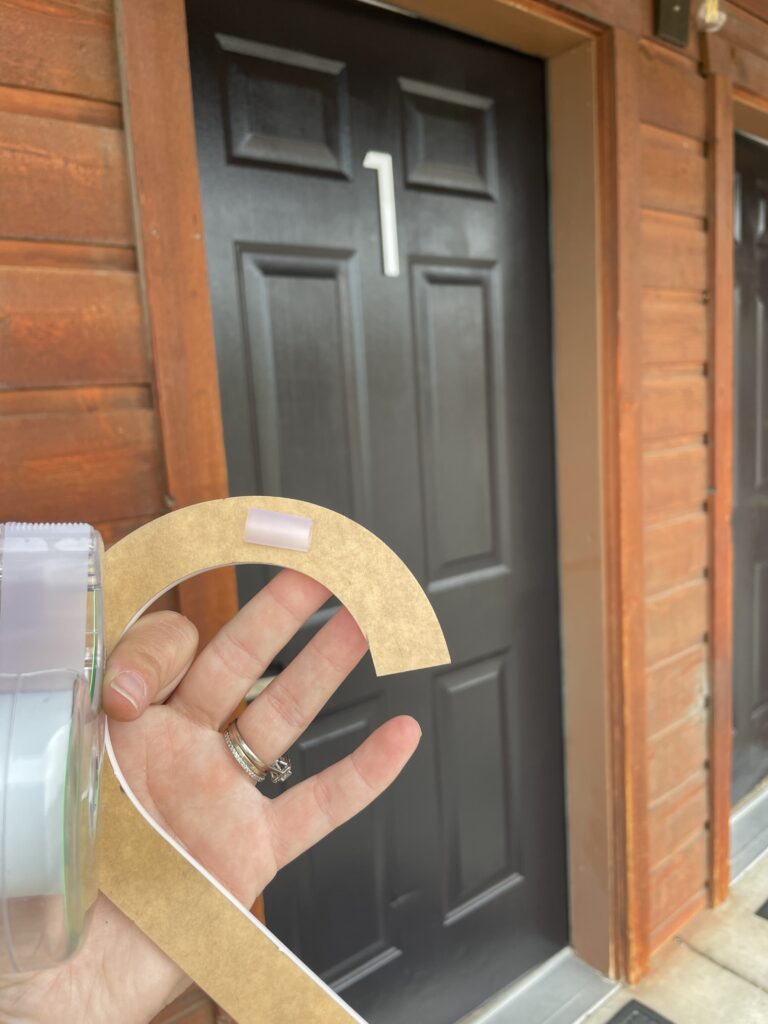
I used a medium weight roller and a brush to even up the lines and remove any drips or bubbles. I then ordered 8 inch door numbers. We tested them horizontally and vertically. Vertical was the overwhelming winner and we went about adding them to the doors. Not without a few hiccups there as well, including Jim getting a few of the numbers backwards!
The final product looks sleek, modern and ready for summer. As well as our new signs. There’s still a part of me that wants to find the perfect blue/green door color, but for now the Hagerman Valley Inn is ready to go!